You CANNOT be serious!

Really and truly I spent ages changing my mind about my book covers – spending so long learning and unlearning how to do various things in Photoshop. The more I learn the less I know. I fiddled about with several completely new versions of a book cover having decided I did not like the other ones. I prefer what I have ended up with but not sure it was worth five hours for something that is not even an assignment.
Ah well. Here are some versions ending with the final (I did do even more than these!).

Number 1

Number 2


see what I did here???

Possible the last version.

And these are not all the versions I have done. Also noticed that I don’t like the way this most recent version bleeds across the edge of the page. I should have had a clean finish with a frame. I have no idea how I even forgot what the title was … perhaps it was because I had the meaning in my mind, and changed the words to match my interpretation.  Wow. That would not be good if I were doing this ‘for real’.

So here it is with the border ….

with border

And then a line between spine and front page … and some bevelled font.

I will not change this again!

Then my daughter suggested that the title text should move to the left …

OK?

You do have to learn when to stop I reckon. This version keeps the retro look that I wanted as it in fashion at the moment (ironically); the text is uncluttered as I set it in a white panel. The repeat pattern of the bicycle has a simple shape and so can tolerate repetition. I like that I have chosen a fairly obscure title but it means I can use a bicycle & these are now very much a zeitgeist. So maybe people would buy it. I am quite pleased with the result and could envisage this on the shelves!

New moves on the book covers

Picking up from earlier work on the HG Wells book covers, I have continued to think about this.

Spine for Volume 2

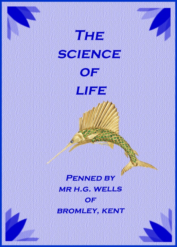
In keeping with the previous cover, I have a plain background, a texturised feel to the colour and a contrast of deep and muted colours. I have downloaded some brush tools to create the art deco corners and other embellishment. I like the way this is turning out. I discovered through my research that the book is about life sciences – not just the human body but all life. Considering Darwin’s ‘Origin of the Species’ and ‘natural selection’ were new ideas around the time the book was written, I looked up ‘fossil’ and came across the fish fossil that seemed quite simple and clear.

From Dandy Beads on Flickr: http://www.flickr.com/photos/ruby_shoes_sam/4147379918/

with Fish Fossil

This was OK; the fossil gives a Darwinian feel – and so is of the time – but I wanted to keep with an art deco theme. So I added something to my search – which was ‘art deco’. Lots of things came up – it seems the art deco period was interested in botany, science and the like. So this is good. (I learned something here about the culture of the time and how art reflects scientific discovery).

demantoid garnet marlin brooch fish sword green gold sea ocean

From Marie’s jewels: http://maries-jewels-royals.blogspot.co.uk/2011/12/green-and-gold-sealife.html I photoshopped this and it took ages to put a background cover in the spaces of the brooch clasp.

Science of Life final Cover

I needed to reshape the brooch to get it to fit nicely with the text.


I almost forgot to talk about how I also explored the idea of having a kind of fabric background for my books. Initially I though about tweed 0 to reflect an HG Wells wardrobe. But this seemed to cluttered.  I then loked at using a simple design to suit a book title and to use this as a print to create a kind of fabric.

Bike on colour

Bike print.

I do really like this and could easily have gone with it, but in the end got influenced by a more minimalist clean look and thought the the print might get in the way of the text. I would obviously have chosen an image to match the topic of the book – and Wells did write about cycling …

Sketchbooks and Learning Logs – Frontstage & Backstage

The OCA booklet outlines what we have to do for our sketchbooks and learning logs. Yet on Staurday when I went to the OCA WhiteChapel Gallery visit there were quite a few conversations about what was supposed to be done in each one. It is clear that people find it HARD. I think it is because of the problem of working out who the stuff is FOR- and what is the genre. This is, in my opinion, a very hard thing about writing. And once you understand ‘who for’ and ‘why’, then you are OK – or at least in a much better position. But academic writing in all its guises is very niche, very specialist. And  lots has been written about this problem. Check out Teresa Lillis, for example.

When I first started to think about the Learning Log and the sketch books I could not quite work out how they differed.  Also it reminded me a bit of when I was at school and the maths teacher would always say:

‘Show me your working out, then I can help you’.

I am not sure if the teacher really wanted to see me hold my hands under my desk, counting out on my fingers. I suspect not. This was not what she was after. In fact, she probably pretended not to see.

10 Fingers

Nor did she wish to see me secretly  drawing boxes and counting them; drawing shapes and trying to divide them up. What my teacher  wanted really,  was to see the next stage of my thinking  – where I showed her I had already learned the steps she wanted me to follow. She wanted the neat stuff. The game was that I had to show her I was thinking  like a mathematician. Or more accurately, that I was thinking like her and working out stuff just like she did on the Blackboard. I never learned to think that way – and I failed Maths – repeatedly. (Or as they say in the USA – I FLUNKED MATH. (singular) – now that actually sounds like a hip thing to do.)

However.  I think I know why I failed Maths. My teacher needed to help me be more honest. I should have been encouraged to put my hands on the table and count my fingers. Or draw diagrams. And she could then have talked to me about how to make the jump between that, and thinking mathematically. Or maybe even … she could have given me the confidence to see that I was thinking mathematically. It is all about confidence. And this I think, is what our sketchbooks / notebooks  are for. Putting down the stuff that really does help you.

Kids playing with shapes - mathematically. Thanks to:
http://istgrade4.wordpress.com/2011/11/02/grade-4-multiplies/

When you are doing a course, there is always an ‘as if’ aspect to it. In the case of me, I have to pretend I am an apprentice Graphic Designer. But really, it is about display; about showing stuff for the assessors. It lacks this authenticity because if you were a jobbing designer or photographer, the sketchbooks need only mean something to you. But when you are doing this for assessment purposes, you have to remember the other audience. So it is ‘as if ‘ you are working this out in order to develop your ideas and understandings, but the notebooks and the learning log are dual purpose, they are also about DEMONSTRATING the understandings and thought processes. For yourself and the tutor/assessor.  It is this dual aspect that makes it hard. This has always been the case when you have to do stuff for academic assessment.

The ‘as if’ aspect, is that you are behaving as if it is all backstage, but everyone knows, the logbooks and sketchbooks are for the frontstage too. It is a stage whisper. What do I mean by ‘stage whisper’? I mean, it is about pretending you are doing this quietly just to privately develop your ideas, but you actually intend others to witness this and take this on board. You are pretending to be unaware of your audience, but you are only doing it for the audience really. (Goffman has written about this in detail btw).  This is why it feels inauthentic. You feel you are supposed to demonstrating that you think artistically through and through. (And this is why students giggle when they take leaflets at exhibitions and say ‘I am going to bung this in my notebook. I will underline some bits!’. )

But this is not it. I think that the log book and the notebook helps us to become the photographers / designers / artists that we want to be. We have to concentrate on this process – and add the signposts to our tutors later.

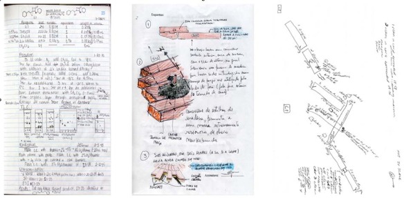
I think when  I use my notebook, I work things out for ME; but I add in bits , little signposts, to help others to understand – labels, titles, opinions, notes. This is an extract from a chemistry notebook – they have to do this stuff too:

I use my learning log to reflect on the quality of the ideas in my notebook; I take things a stage on and think about organising my thoughts so they are ready for an audience.  This is more about analysis and critique. Maybe this is closer to ‘The Pitch’. You tell the audience, these are my ideas and this is how I got to them. The Learning log is a streamlined version  (not stream of consciousness) – where  you explain why some ideas are not so good, in order to outline your learning journey. I get the feeling that while the final product is important, the thinking behind it is also very important.  It is showing that you realise you need to THINK, and that proper artists are rarely miraculously inspired; that deep thinking is a requirement and that creativity is a product of hard work.   That’s how I am doing it at the moment anyway.

And how does this post fit in? It is me analysing what a learning log is so that my learning log can become a bit better!

Gillian Wearing, The Peepshow & Ethics

Peeping in to view the videos.

I enjoyed the Gillian Wearing show at The Whitechapel Gallery. I liked her sense of fun and her explorations of identity through her use of masks; her invocation of Goffman and ‘the presentation of self in everyday life; and her crazy dance in Peckham.

I have been thinking for a while about the relationship between photography and research. I have written before about the ubiquity of digital photography and the auto-ethnographic disposition that this seems to foster in many people. I think that the affordability of cameras and the ensuing low/no-cost production of images means that many people nowadays continually photograph their lives and view images of their daily experiences even as they live them. This gives individuals multiple ways of viewing, reviewing and reflecting on themselves and their lives in ways unknown before the digital age. This ethnographic aspect however, is a kind of by-product of photographic behaviour; most people with digital cameras do not probably intend to carry out auto-ethnographies! They just like taking photos of what they are doing and sharing them.
In the case of professional photographers, most obviously photo journalists, their work researches issues of a social, political or even cultural nature. And we often see how ethical considerations become quite a poignant aspect of their work.

Art photographers also explore issues with their cameras and many are undoubtedly carrying out research through their photography. For example the work of Lewis Hine and Daniel Meadows; two exhibitions I really enjoyed. I loved Briony Campbell’s ‘The Dad Project‘; Briony was interviewed and filmed for the OCA’s blog – which included a reference to how Briony dealt with some of the ethical issues involved in this work.

There were all sorts of things I was intrigued by with Gillian Wearing’s exhibition and I may post about this on my other blog, but here I want to just say something brief about ethics. One aspect of her exhibition featured a series of ‘confessional’ type videos where individuals had volunteered to talk about traumatic incidences in their lives. In doing so they were asked to wear masks and to be filmed. Some of the stories were shocking; the people spoke of sexual abuse; emotional abuse; other types of physical abuse and so on.All kinds of stories from all kinds of people, who had been at the mercy of others. Some of them were very moving and it was also awe inspiring how some of the people seemed to have moved on in their lives. It was astonishing how outspoken people were, how frank. I have frequently been surprised how willing some people seem, to talk in front of a camera – and maybe they are excited by the idea of film and the sense of being a kind of celebrity because of this. In agreeing to be filmed, and perhaps even being told a bit about GW’s work, I still wonder how much informed consent these indviduals were able to give. Did they know how many people would listen to them and in so many places and situations? Were they given support after their confessional filming? Did they regret taking part?

Where I work, in a School of Education in a University, any research we carry out must first be cleared by going through an ethical review procedure. This is the case for all University research. I believe this is a good thing, not just because it ensures we do not exploit research participants (note I do not refer to research ‘subjects’ here) but also because it leads to better quality research in my view. The re-positioning of people from subjects to participants means that not only do we acquire properly informed consent, but also an additional angle is introduced into the work. Perhaps this is why Helen Rosmier’s image of The Chair is so effective (as Clive describes in this video).

I worry that in taking a glimpse of people’s lives in order to explore the affect of masks and to produce an interesting project for display, some damage may have been done to individuals. I have no idea if this is the case, but I think that ethical procedures should be transparent – for journalists and artists as well as for university and clinical researchers. As a visitor to a museum, I want to know that no one came to any harm because of their involvement in the making of exhibits.  I think that information about the ethical process should be shared so that participants are always protected.

I could not help seeing the similarity between Victorian peepshows and the confessional boxes of the Wearing exhibition:

Peeping into view the videos.

Painting by John Burr. Thanks to blog at http://tywkiwdbi.blogspot.co.uk/2010/09/peep-show.html

Arthur Rackham Peepshow.. thanks to blogger of 'The Victorian era': http://19thcentury.wordpress.com/2007/10/28/arthur-rackham-illustrator/

Girona Peepshow: thanks to : http://thebioscope.net/2011/04/page/2/

Book cover stuff

Lots of notes in my notebook but here is the stuff I have done today … been fiddling around trying to remember how tomix the colours etc and have messed about getting some art deco effects to add to my book cover. Only done one, but this is one of a series of 3. The others will follow the template. The template consists of font, layout and use of a few brushes to stamp an art deco pattern on.

First bashes included:

This has a texture but is blurred.

This was OK- ish . I wanted a pastel colour at first .. thinking to have a pale shade for the background of each volume. Also a dark coloured frame. I wanted corner embellishments though. And I could not get these even. The font is not bad. I am trying to get one that is angular but also soft in art deco fashion. Elegant I guess.

Swopped to blue as I like the idea of a blue and green combo to get the stained glass idea of art deco. Different font now - this is Optima.

Not sure the spacing was right and so had another go, this time also bending the text to an arc. Think this is looking more professional.

Arched arrangement

Then I found at last, some embellishments that give it more of an art deco feel.

with embellishments

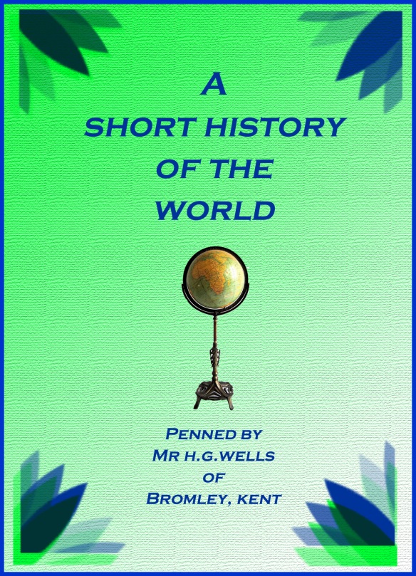
This may be a bit packed with detail I am not sure. But I like this one. I used the same size as my postcard for the front cover dimensions. This may be a bit small but the proportion seems OK. Obviously the colours were set, also the font. I wanted just one image, and one that also was of the time. I focused more on the word ‘World’ than ‘History. This is echoed in the image, but also in how I noted where HG Wells lived – Bromley Kent.
This detail was a bit of a dig at his somewhat idiosyncratic style which was hinted at in one of the sources I found – which said he was more of a fantasist than a scientist.

Texturised, with embellishments. A gradient colour as opposed to a harsh block.

I found the image of the globe as an item for sale in etsy.com.

Perhaps a bit boring in the end?

Finally I think the result is OK. Looking a bit like he has chosen to self-publish like a boy scout attempt at writing ‘The History of the World’. I think such a title is ridiculous really and so deserves a bit of a send up.

The Design Council

Listening to Radio 4 this morning, The Today Programme, I heard a piece about how The Design Council had set up a competition to design things that would make the lives of people with Dementia.

I actually did not know that The Design Council set up problems like this; in fact I had not really thought before what The Design Council is. Reminds me a bit of The Style Council  – something veru different – but in fact I thought that The Design Council was a kind of ‘approving body’ for good design.

Anyhow I was very impressed with the ideas that had won the challenge – really left field type of things. I loved the idea of ‘Ode’ a kind of  ‘smell stick’ which can be set to emanate food aromas at mealtimes, reminding those with dementia that it is time to eat. A bit like an alarm clock but arousing different senses.  I really like the video they have on The Design Council site (previous link) which gives text as well as sound to put the message across. Very accessible.

Anyhow I feel very excited about The Design Council, and thought, what a great place to work. Of course it is in London. And all the Trustees bar one, (Deborah Meadon) are aged 40+ white men. Not very representative really. I have nothing much against 40+ white men (am married to one) but with all I now know about The Design Council’s role, I would have hoped for a wider spectrum.

Thanks to http://www.siriuswd.com/web-design/ for the image.


H.G. Wells

Masses of stuff online about Herbert George. I cannot believe how many books he has written – over 20 novels, several works of non-fiction and about 50 short stories. In addition I discover he was married twice, had numerous affairs, was a socialist, a diabetic and believed in eugenics. His second wife apparently agreed he could have affairs. I have heard that one before. In his biography he says: “I was never a great amorist, though I have loved several people very deeply”.

Our George was a bit of a mix really. Not sure I would have liked him.

In terms of primary research there is a lot to be done – reading all those books, or at least a sample would be appropriate. I would skim through the texts of a few books. I have never read any of his books – I don’t like sci-f i in general. So I think I would prefer to work on the non-fiction.

Also looking at the ways in which others have designed book covers – looking on Amazon and in the bookshops to see what has already been done. (I think this research would be primary. Some may see it as secondary as it would be looking at the collections others had made – but if I am looking at the design of the books I think this is primary research.)

there’s a lot of book cover images on Google already, eg:

Google Images: HG Wells book covers

I prefer the simple ones I think. Like these. And I see these won an award:

Other primary research would be:

  • Interviews with George – not possible as he is currently unavailable;
  • Interviews with relatives – this may be secondary or primary, not sure;
  • Investigation of socio-cultural context
  • Looking at whether there are unpublished manuscripts

A great deal of secondary research could be done and you would have to do a trawl to see what is out there and then decide what kind of thing to focus on. I think I would watch a few films to see the general themes and get the mood of the books.  So seeing films would give me a flavour.

Other secondary stuff would include:

  • Biographies
  • recordings of interviews
  • Critiques and reviews of his life and works

Finally I think tertiary work would include going to museums and exhibitions and looking at websites, especially wikipedia.

Wikipedia has so much info it would kill me to trawl through all that; a scan for highlights maybe and then I reckon the next thing to do s to find out a bit about the era in which a few books have been written. I would focus on some written in the 1920s and go for a style that I could associate with the time. I think that would be a bit more interesting research wise. He had a good long life really and it spanned across centuries s you can pick a good moment I guess.

The loveliness of the roaring 1920s can be seen here.  It might be nice to have this STYLE: 

The 1920s. (Google image search)

 Maybe I would cheat and go for the decorum of art deco as well though. This is probably more 1930s.

Ok so we know that:

He was a teacher, a draper, a politician, a misogynist, a suffragette sympathiser (really?) and a socialist pacifist. He spent a LOT of time writing and had two children.

I think I will pick three books all linked together to design book covers for; these are described by wikipedia here:

Wells also wrote nonfiction. His bestselling three-volume work, The Outline of History (1920), began a new era of popularised world history. It received a mixed critical response from professional historians.[22] Many other authors followed with “Outlines” of their own in other subjects. Wells reprised his Outline in 1922 with a much shorter popular work, A Short History of the World,[23] and two long efforts, The Science of Life (1930) and The Work, Wealth and Happiness of Mankind (1931). The “Outlines” became sufficiently common for James Thurber to parody the trend in his humorous essay, “An Outline of Scientists”—indeed, Wells’s Outline of History remains in print with a new 2005 edition, while A Short History of the World has been recently reedited (2006).

Being a Jackdaw

Magpies are known to collect things; and Jackdaws are known to share what they have and to collect things for other birds.

#322 藍鵲凝空 (Freeze in the air !)

Taiwan Blue Magpie

Thanks to JohnFish on Flickr,from whom I borrowed this photo.

When I was a teacher and a teacher trainer I used to encourage students to be Jackdaws and Magpies.  Sharing stuff with others is not just about saving time; it is about understanding what is in the world around us – looking not just from our own perspective, but also that of others’. It’s about  wearing other people’s shoes; looking at the world from where they are. Trying on someone else’s design, seeing where you need to trim, change and adapt it for anew purpose. The OCA encourages a collecting mentality too and this is good in so many ways – as it gives PERMISSION to take ideas from others. Of course you do have to develop these and the skill is in how you use things and develop them – fit to purpose.
I work with Eve – who in her previous career was a designer. (Once a designer, always …) She has now switched career and researches in education; she has become an academic in fact. She told me that she found it strange that in academia   claims for originality are required – that you have to constantly suggest you are making an original contribution. Because, she said, nothing is new and all ideas come from somewhere. This is something she had ‘drummed into’ her as an art student. Everything is derivative. I agree with this of course and that is why so many academic texts are crammed full of references to where ideas come from. This attribution complex is something I would want to maintain  in my graphic design journey – to acknowledge where things come from as well as trying to do something new.  I appreciate this difference in the way designers are more honest about derivation and the impossibility of originality.

Which is all a convoluted way of talking about being a collector in the OCA course. I am not really a natural hoarder and so will find it weird cutting out bits and bobs from magazines to put them in a box file … but I will do it.

I also love the idea of a SWIPE file. It is so lacking in shame. So blunt. Maybe it could be bettered by words like SWAG and LOOT. But swipe is great.

swag

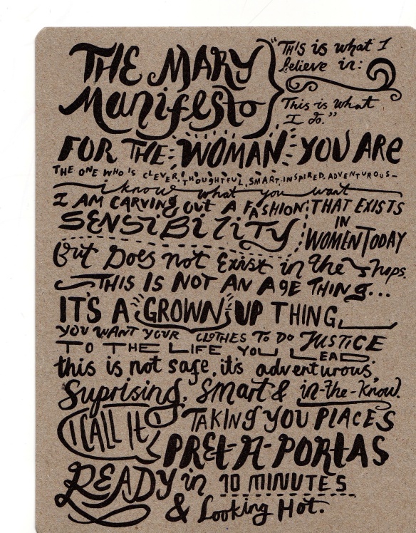
I have one item already – some packaging from a pair of tights labelled up by Mary Portas:

I like it for the way it uses lots of different fonts to catch your attention. Perhaps it is a mess though. But it made me want to read it. I also noticed it was on card that looked re-cycled – wearing its virtues clearly. (even though the Portas brand is not really one I associate with being environmentally friendly).

For years I have been collecting stuff digitally. I have in excess of 100 CDs with photos on. Also I have lots of lovely folders in my OCA desktop folder.

On Flickr I also have a lot of stuff in sets … and now have a collection of sets for the OCA work:

Also I have for many years had a set of favourites on Flickr … I noticed long ago how Flickr encourages archiving. But Flickr archives tend to be about the digital representation of the self as opposed to stuff for design. (Are these the same thing?). I have started putting things in this set that are to do with OCA work. Sadly I don’t think it is possible to create subsets of favourites.

So that’s it. Just the start of a new way of collecting. I promise to gather together bits and bobs. Real life things. Away from the virtual. Well, that’s a mind shift for me.

New Literacies Logo

I have had a ‘real’ design problem this week. I wanted to have a logo for the research centre I belong to. We have just changed the name and I think we need to try and develop a brand image if we want to look slick! (ha ha) I spent ages messing around with several completely different ideas but ended up returning to one of the early ones. I realised I needed to test out the logos on letter heads and on Powerpoint slides to see that it fitted with all formats.  I think also it needs to fit a bit with the University of Sheffield logo as sometimes I will need to use them together. I also ended up realising you cannot stretch a jpg file forever without it ruining the quality – it ends up too pixelated and the colours go ‘thin’. So I made several versions of each design in the end. Ideas included just using letters – I do like the simple OCA logo – but I think that you can only use the acronym if people know what it stands for. But then when I added the full name it looked daft imo. So I ditched that. Then I decided I liked block shapes and went for coloursrs that were intense like iPod nanos. But the text was not clear enough. So in the end I think I am going for this, but will have to see what my colleagues think I guess!!

Letter head version

Postcard size so it can be used bigger on documents.

Then this is the Powerpoint size: I then decided to do a piece without the centre name on it … took me a while to realise I could not create a ‘twirl’ without adding a block of white at the side of the image. Trial and error – many errors, many trials. I think I must have at least 50 attempts in my folders.

I have learned a lot from doing all this.

I also realised that when you do this kind of thing you need to keep careful notes of filters, colours, fonts etc so that you can replicate everything for a different size.

Working to a Brief

Moving into the second part: Problem solving and the first exercise on working to a brief. I have annotated the pages of the file – I quite like having a folder of materials to hold.

Brief 1

This is about designing a new Quaker Oat packaging format. Important points of the brief include:

  1. Target is young women
  2. Needs to be healthy and tasty
  3. Naturalness key – but not bland
  4. Needs to be quick and easy to make – idea of juggling priorities.
  5. It is clear to me that the purpose is to increase sales – especially to this group of people who they may think will be particularly lucrative OR who are currently not buying this stuff.

I would want to ask:

  1. Are there limitations on colour?
  2. Does it have to be a cereal box – similar to others for stacking purposes in the supermarket etc
  3. Does it have to have the logo of Quaker and stick to that house-style?

I would like this brief the best! It is probably the most restrictive but this means that I can have more chance of coming up with an idea they think is OK.  I also understand the target market quite well – I am not young – but am subject to the lifestyle preferences they detail.

I would want to have the Quaker oat packets in portion sizes; calorie counted; in packets like envelopes and seeing girls popping these in their little handbag to take to work and have as a ‘convenient snack’ as well as a good start to the day. Perhaps the size and shape should be the familiar cup a soup format – small envelopes in boxes. Using a familiar format is good as people will recognise it .

Packets would have retro design work on them – conjuring the idea of – like grandma used to make . So the design would be foksy, gingham probably, and neutral colours.

Brief 2

This is about promoting the use of trains – and there is a theme of connections to follow.  I think this tries to encapsulate the excitement of travel in a new way.  I would not like this brief because

  1. The target group is unclear
  2. The creative idea is re-decided – and is poetic/thematic in a way I don’t like much.
  3. It is not clear how success would be defined…
  4. where would the ads go – poster? Tv? on the train?

If I were to set up this campaign I would base it around being environmentally aware – I think this would be better and I would find it hard to forget the importance of this.

I would want to show people taking their bikes on the train on the morning commute and putting forward the idea that trains can be part of the everyday commute. Maybe laughing together as they have a great time meeting the same people regularly as they travel and relax. Bikes could be the retro sort – this kind of thing is popular at the moment – but maybe better to have foldies so that people see the whole convenience thing in action.

Brief 3

This is about raising awareness of the dangers of drinking alcohol and so is targetted at the young – via responsible adults who care for them.

The campaign asserts that:

  1. Children need care
  2. Adults should care for them
  3. Alcohol is bad and unhelathy
  4. The state is in loco parentis
  5. Children need protecting
  6. But that although the state is in control … individuals need to feel empowered to say no to booze!
  7. The idea of health is closely bound to happiness – – ah what a shame for those who are unwell and happy.

Ideas about the campaign:

  1. Strip cartoon/photo-story format
  2. Showing kids having a great time
  3. Being tempted by alcohol
  4. Saying No
  5. Having a great time anyhow

I would set this in a trendy location and maybe try and use celebrities as part of this whole thing. Perhaps super uber healthy people like olympic champions would be in my ad. To counter the idea of bodily perfection and happiness I would use para olympic stars.